
Kere Media
Kere Media is a marketing and production agency that wanted to break away from the usual, predictable agency look. Their idea was all about creating a sense of breakthrough almost like glass shattering, to show how they approach things differently. I brought this idea into the branding by using glass-shatter references in the logo and patterns, building it into a modern, digital-first identity that feels fresh and eye-catching.
Client
Kere Media
SCOPE
Brand Design and Illustrations
YEAR
2024
ROLE
Brand Designer

INSPIRATION
The initial direction for the brand was inspired by glass-like textures and shattered surfaces as seen above. Bright pinks, blues, and yellows became a key part of the visual language, bringing in the eye-catching feel. For the logo mark, the approach was kept minimal and adaptable so it could work seamlessly across different applications.
All images, illustrations, and visual references used belong to their respective owners and are used for presentation purposes only. Full credit remains with the original creators and copyright holders

222223
FFFFFF
454ADE
FF2DB9
666165
F3FEA1
[Hover over]
I explored few logo options but we decided the first one worked best, Although the client wanted the font to remain same.

for the logomark, I created a glass-shattering element where the shards come together to form the letter K.
[Hover over]

BLOG COVERS
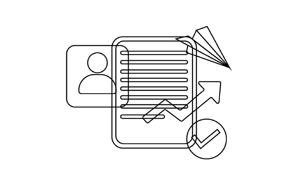
The blog cover illustrations were designed to make strong use of the brand colors, creating visuals that feel bold and eye-catching. Each illustration was also made uniquely for its respective blog topic, making every cover feel distinct and more clickable.
See them in action here

I also made some 3d illustrations for their website
[Hover over to see how they were constructed]
See them in action here


SOME ILLUSTRATED STICKERS

OTHER DELIVERABLES


